
Research- Emotion Journey Map
FEELING
Opens app
Confused/
overwhelmed
Help express
mood
DISCOVERY
Browses/
searches music
Curious/
searching
Suggest mood-
based music
REFLECTION
Writes journal
Introspective
Make journaling
seamless
LISTENING
Plays song
Connected/
immersed
Prompt reflection
REVISIT
Returns to past
entries
Nostalgic/
aware
Strengthen
memory loop

Solution
Octava transforms music listening into a reflective experience by
allowing users to capture emotions alongside songs — turning fleeting
moments into meaningful, revisitable memories.
Observation
Music is deeply tied to personal emotions and memories. However,
existing platforms prioritize consumption over context, making it
difficult for users to preserve or revisit the feelings associated with what they listen to.
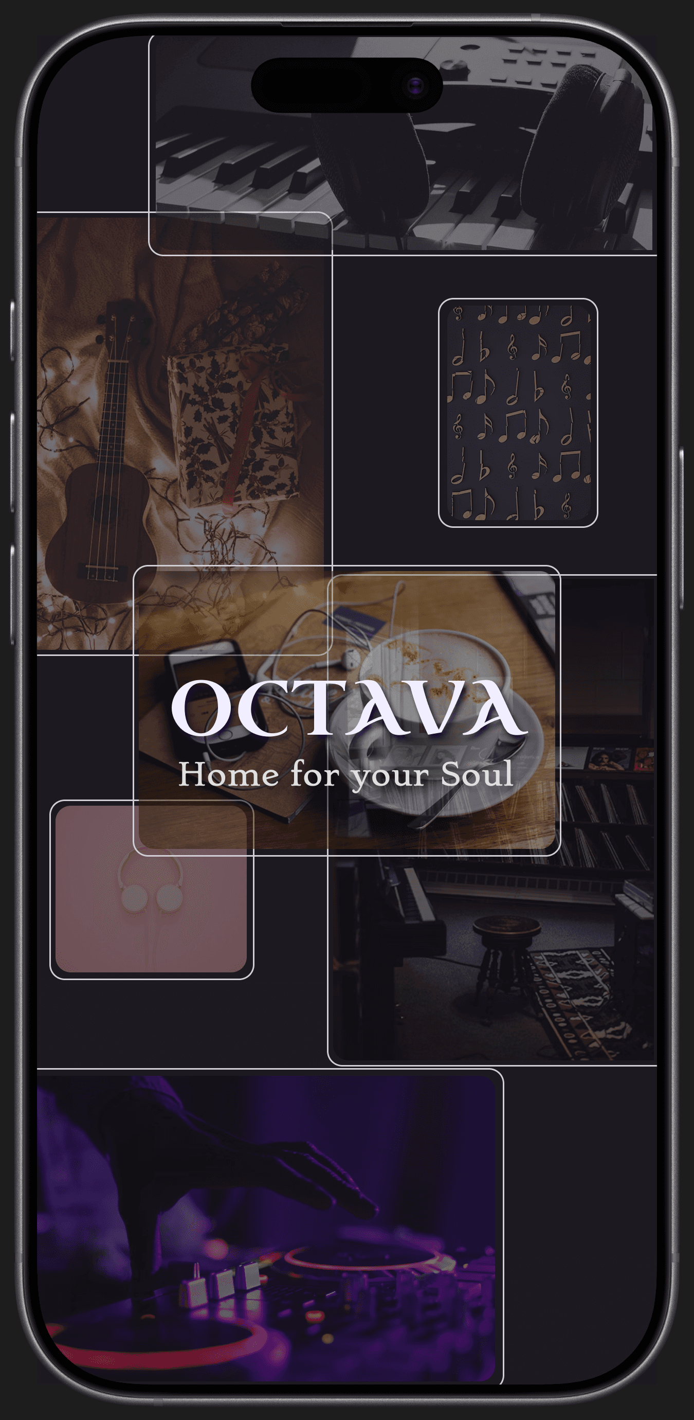
Home for your Soul
OCTAVA




The Central Idea of Octava


Covers user authentication and initial personalization to tailor
the music experience.

Shows how users explore music and transition into
reflective journaling.

Captures how users document emotions
and revisit past listening experiences.
Research- User Flow


Icon System
Simple, recognizable icons designed for clarity and consistency




Finding the right colour for easy readability
was a task in making the splash screen.
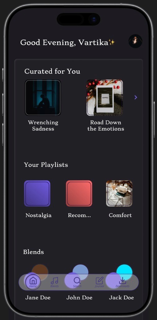
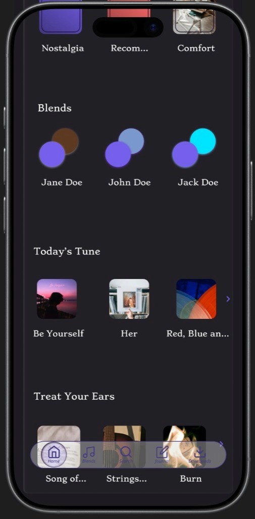
A single card container was opted for the sections
to maintain uniformity and less clutter in
the home page.

Search is made very engaging with trending and
recent searches, followed by sweet notes and
messages by user's favourite artists.

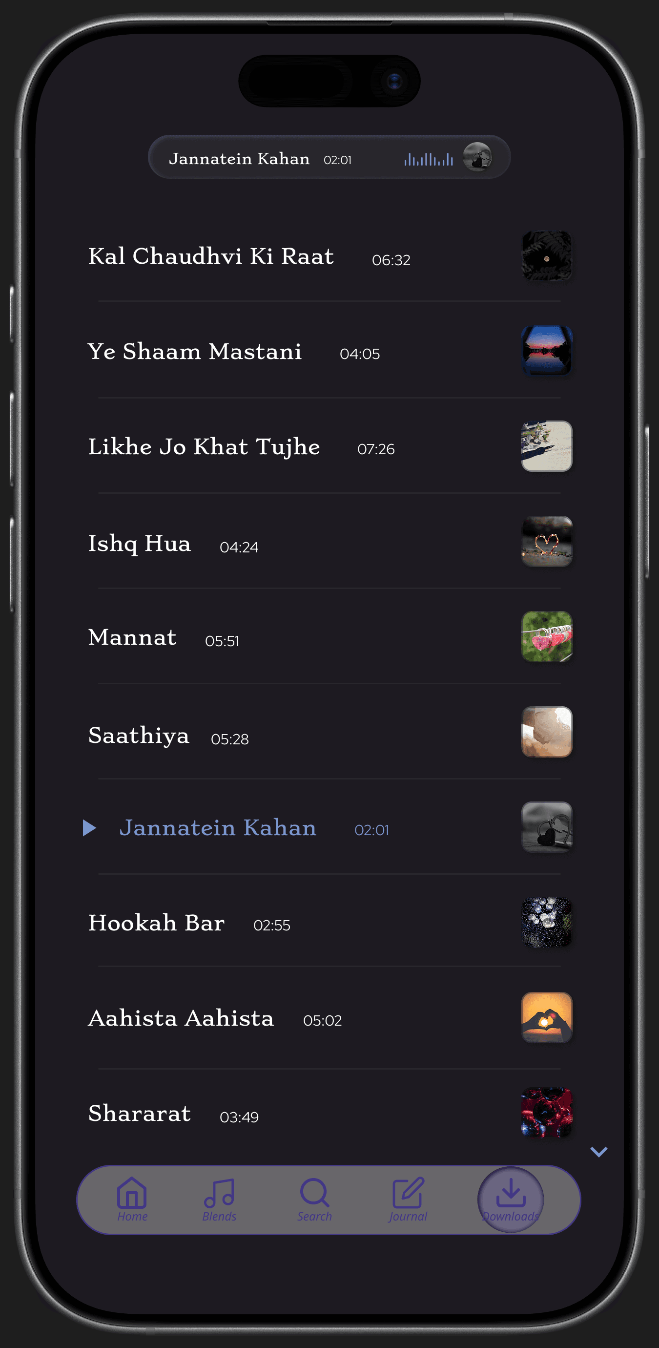
Songs in playlists and downloaded section
appear in a simple and readable list form.
Current playing song details are shown
towards the top, making the navigation for
user easy.

The Endgame
Final Experience

Lastly, the profile contains basic details followed
by some user's personal favourites' details;
all these details can be edited whenever desired.
Sign in screen was kept simple, with a deeper
colour used for the log in button for it to pop more.
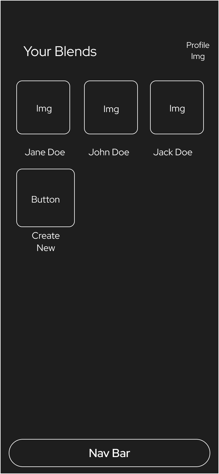
Blends section is kept simple, with blend names
being the friend name as default.
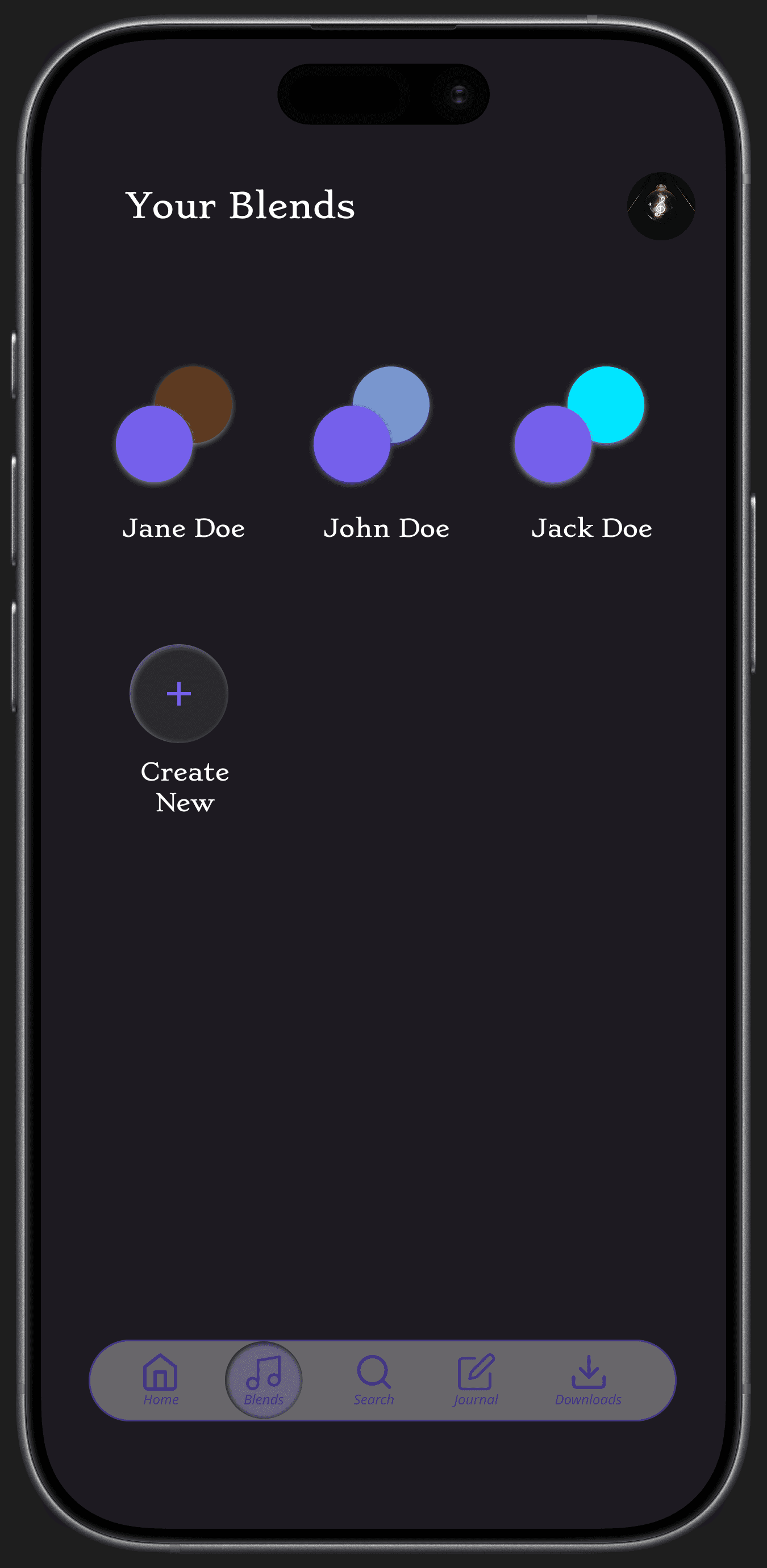
Editable blend covers, with taste match
percentage is opted for the blend screen.

Now playing song details has icons with the
off /inactive state(grey colour), and on/active
state (white colour).
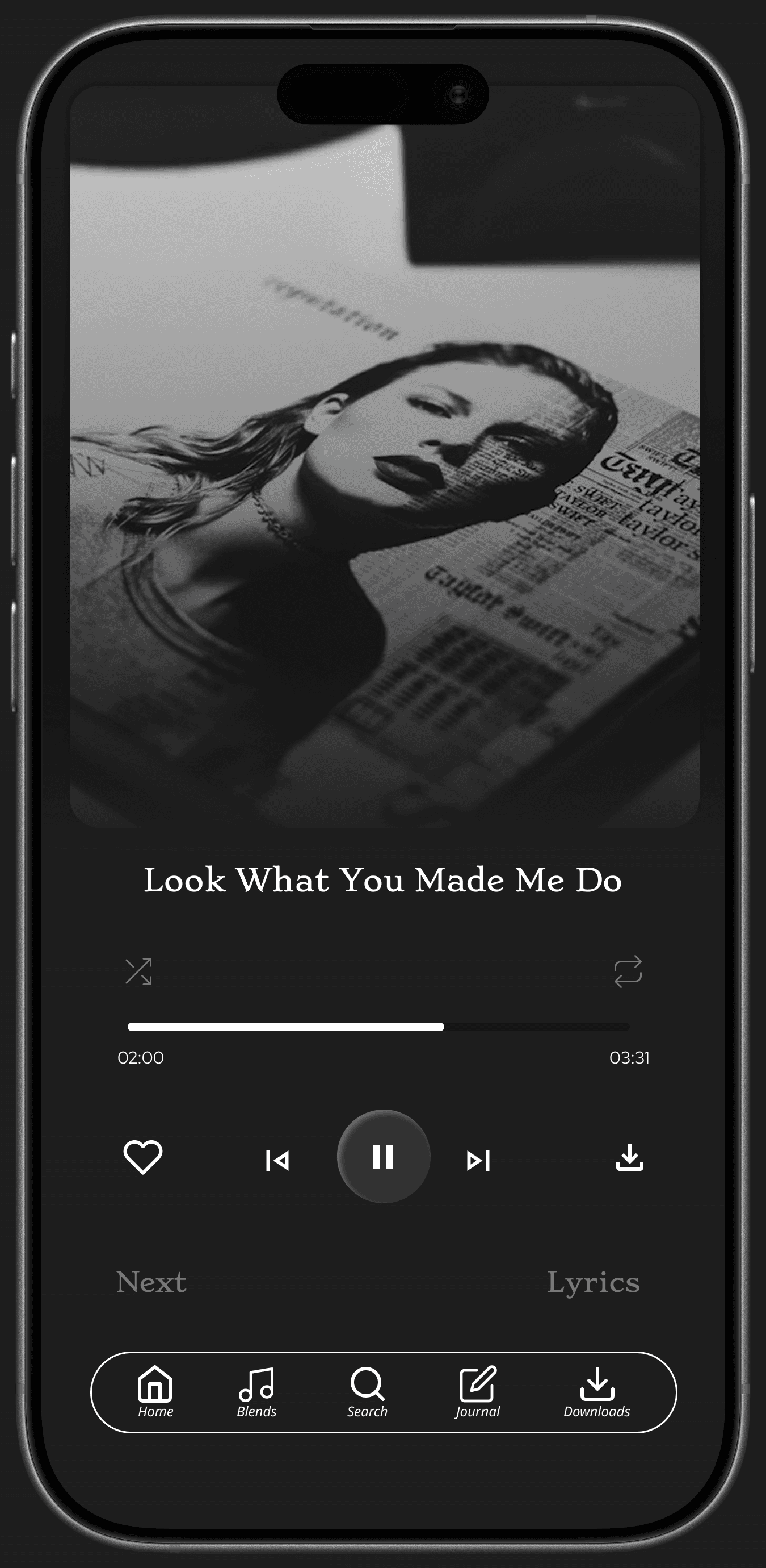
When all icons are in their active state, their
colour changes to white, and liked song is shown
using a heart with green colour outline.

Journal while listening to music, and save the
song name with time stamp to revisit the
experience.

Listen to music while journaling in real time.
Edit the journal cover, text style, and even the
song details when desired.

Colour System
1A0B2E
7A97CE
7560EB
B99CEA

——- Case Study by Vartika Tiwari ———
"Music, once admitted to the soul,
becomes a sort of spirit,
and never dies".
-Edward Bulwar Lytton
Key Takeaways
Simplifying user flows had a greater impact than adding new
features, improving overall usability and clarity.
Maintaining consistency across icons, colors, and
typography helped create a cohesive and intuitive visual experience.
Balancing aesthetic expression with functional usability required
careful iteration and prioritization throughout the design process.
Structuring the case study as a narrative improved
how the design decisions and outcomes are communicated.
With more time, validating these decisions through user testing
would help further refine and strengthen the final experience.